Smart Tracker Brand Identity
The Challenge : To launch "Oi," a startup aiming to make smart tracking technology affordable for everyone. The challenge was to create a strong brand identity that communicates quality, trust, and user-friendliness, allowing Oi to compete with global giants like Apple and Tile while highlighting its commitment to value and accessibility.

Brand Strategy
Mission: To provide peace of mind by connecting people to their belongings through simple, elegant, and reliable technology.
Vision: To create a world where losing something is a thing of the past.
Target Audience: Tech-savvy millennials & Gen Z, busy professionals, and families who value good design and seamless user experiences.
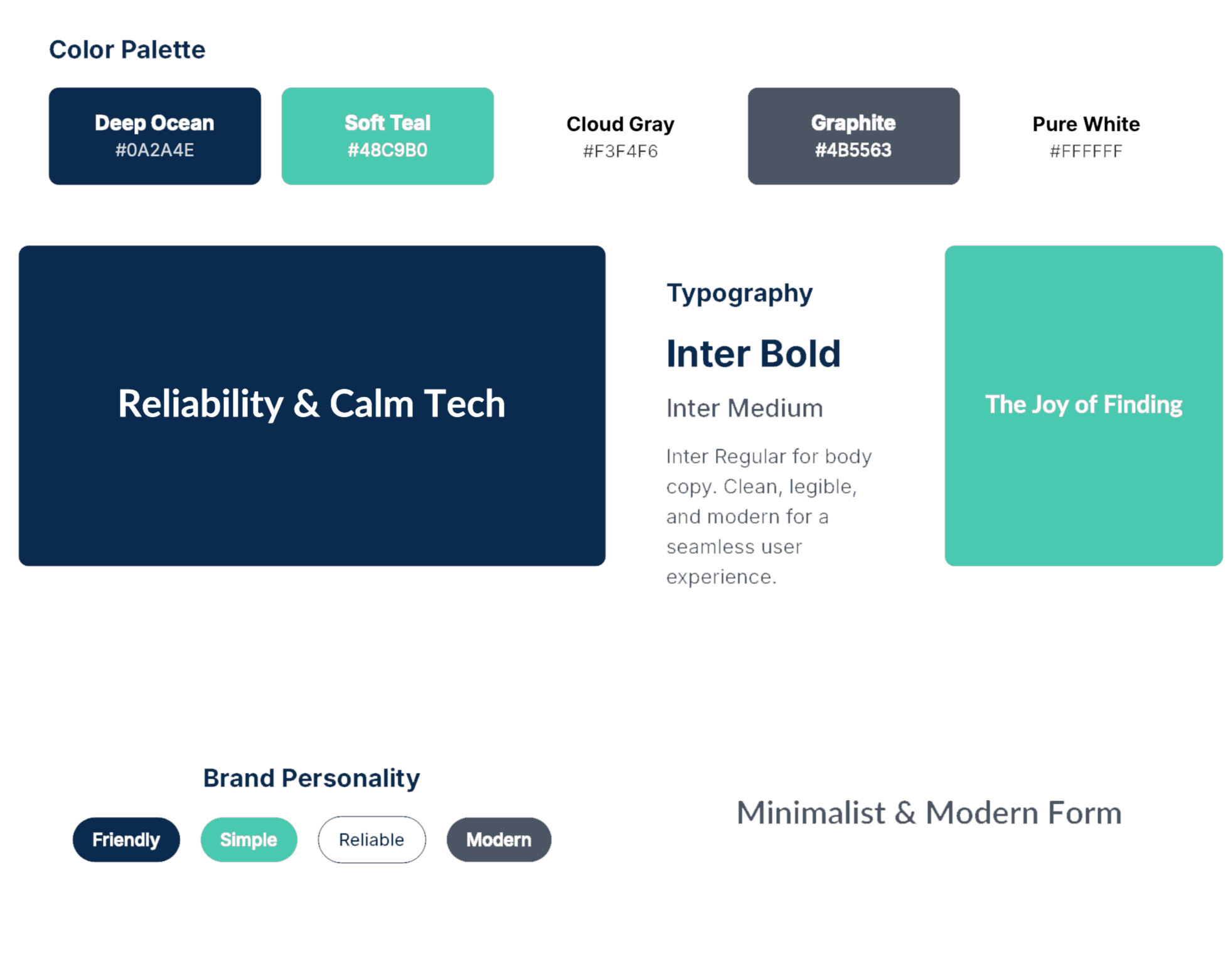
Brand Personality: Friendly, Simple, Reliable, Modern.
Brand Application
Visual Identity
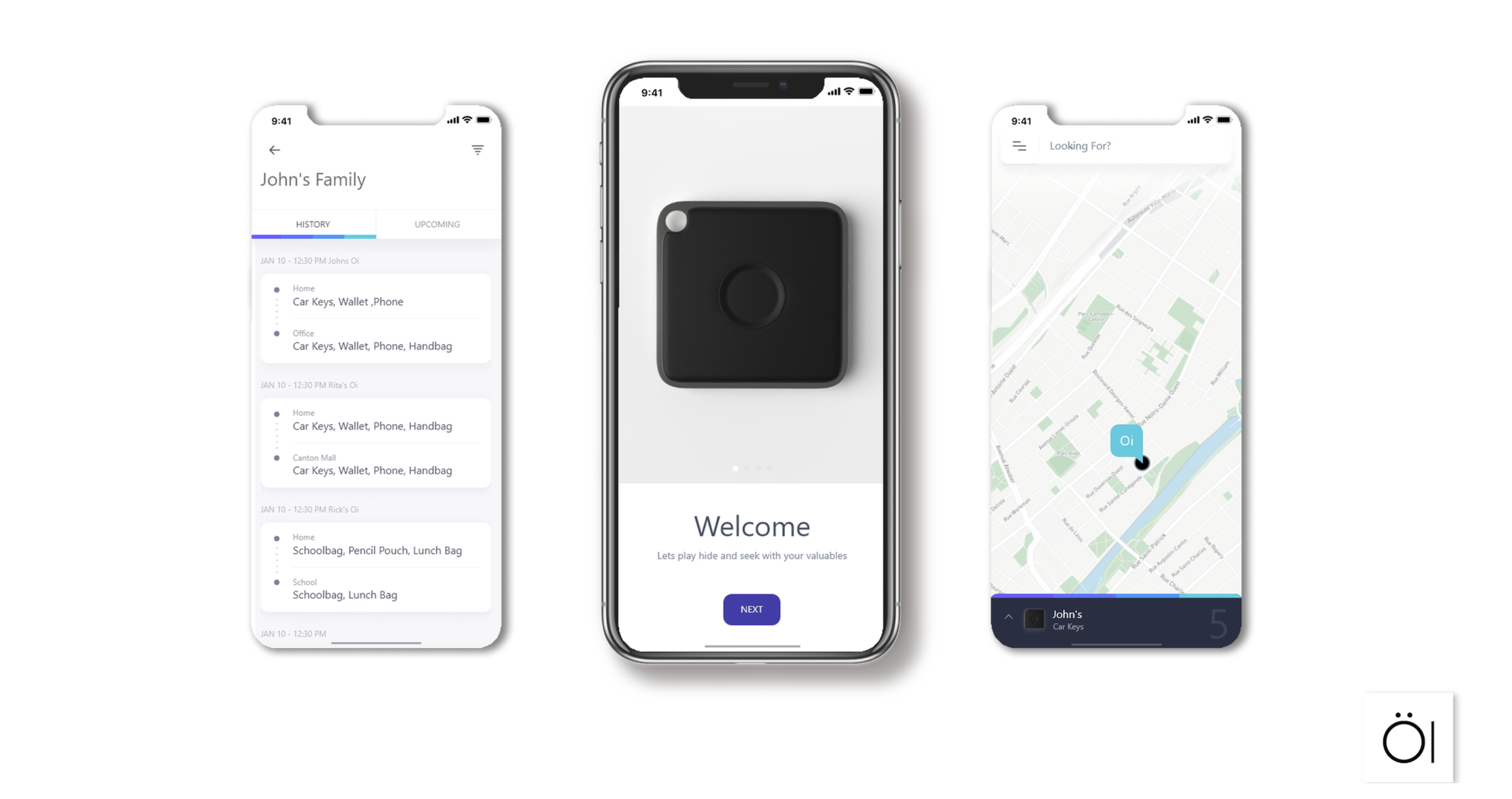
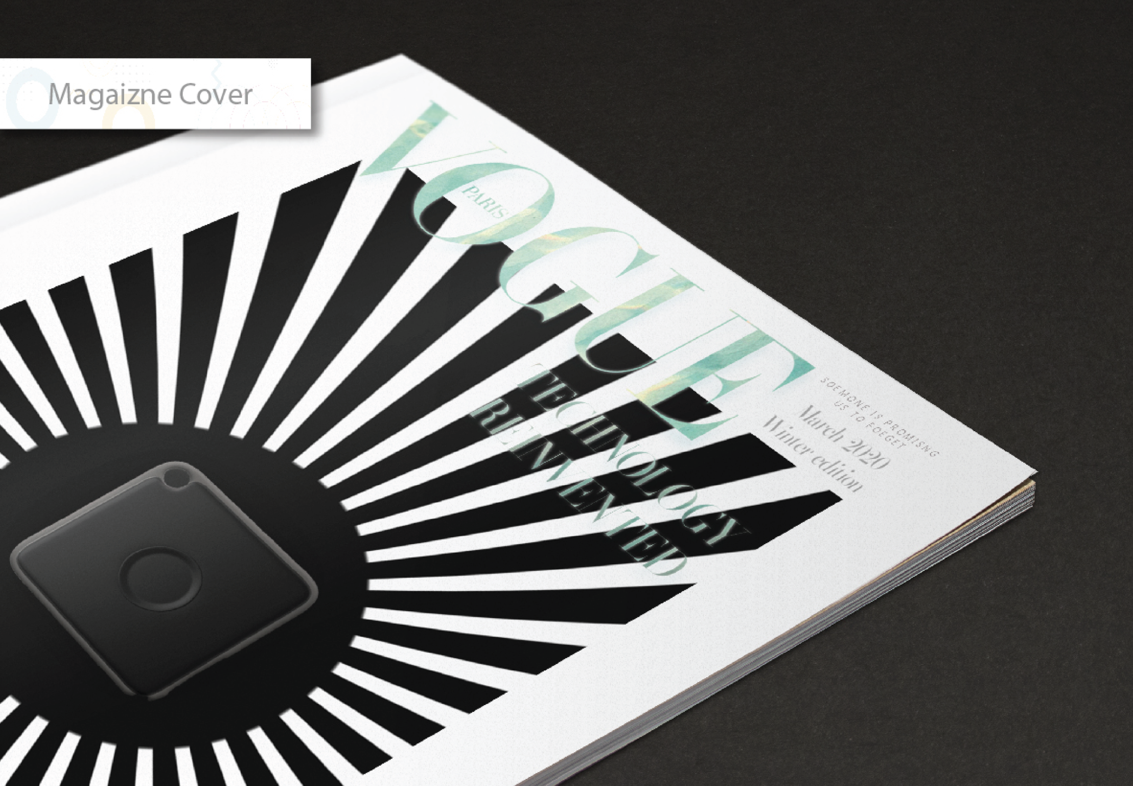
Product Design: A small, smooth, circular device with a matte, soft-touch finish. The design is unobtrusive, elegant, and durable, reflecting the brand's core values.
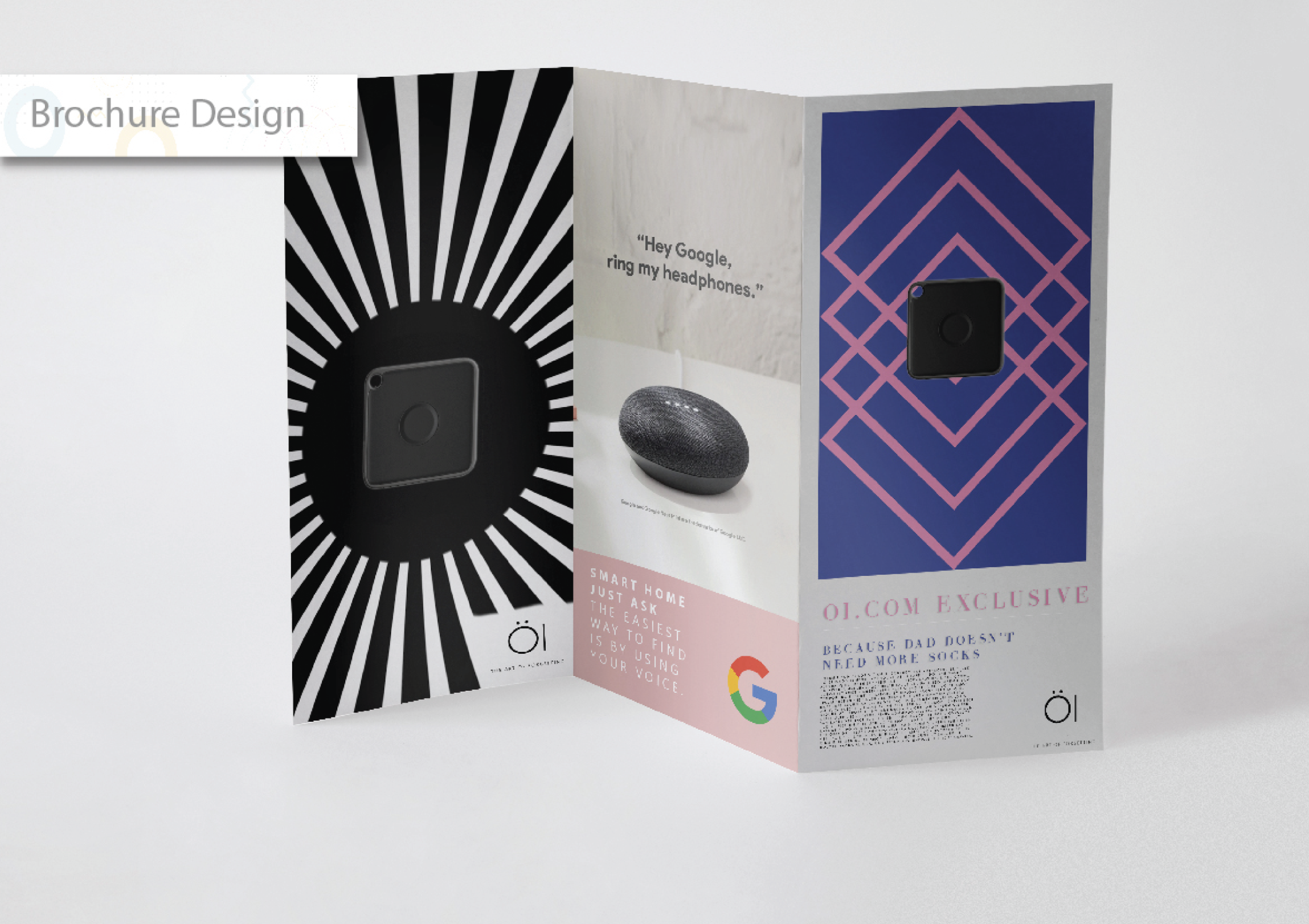
Packaging: Minimalist, eco-friendly packaging using recycled materials to create a simple and satisfying unboxing experience.
App & Web Interface: A clean, intuitive UI with a clear visual hierarchy. The focus is on stress-free usability, allowing users to find their items quickly on both iOS and Android.

The Solution
A complete brand identity was developed, positioning Oi as a friendly, intuitive, and essential lifestyle accessory. The strategy focused on minimalist aesthetics and a user-centric approach to build an emotional connection and stand out from the purely functional competition.
The Logo: The name "Oi" is a friendly, universal exclamation. The logo uses a clean sans-serif font, with the dot on the "i" transformed into a map pin/radar ping to visually represent location and finding.
Color Palette: The palette is modern, calm, and accessible, designed to feel more like a lifestyle brand than a tech utility.
Primary: Deep Ocean Blue (
#0A2A4E) - Trust, ReliabilitySecondary: Soft Teal (
#48C9B0) - Success, FindingNeutrals: Cloud Gray (
#F3F4F6), Graphite (#4B5563), White (#FFFFFF)
Typography:
Font: Inter
Style: A clean, highly legible sans-serif used in various weights to create a cohesive, modern, and uncluttered visual hierarchy across all platforms.